U.S. Department of Education
A Responsive Mobile and Desktop Redesign Case Study

Executive Summary
Designed to better convey the mission and services of the U.S. Department of Education and establish a more enjoyable and streamlined experience for users, the responsive web redesign of the department’s website addresses current UI pain points and implements desktop and mobile solutions through high-fidelity prototypes, demonstrating new navigation, page layouts, information architecture, and atomic design.

Before

After
Project Overview
Background: The U.S. Department of Education promotes student achievement and preparation for global competitiveness by fostering educational excellence and ensuring equal access. The department educates people about education requirements, laws, data, funding/grants, and equal opportunities in education, and provides a framework for the education sector, acts, and legislation to promote equal learning opportunities.
Problem: The site is designed for use by the public sector — specifically college students, parents of children of all ages, and researchers — school officials, and educational institutions, but does not provide clear paths for these different users.
Solution: Our team used user-centric research and design to address existing problems and pain points relating to the current website navigation, information architecture, and UI and determine how the site could better tailor information to its key users, present extensive and important resources in a streamlined fashion, and embody a pleasant and helpful tone for those seeking educational information.


My Roles & Responsibilities
-
Conducting Usability Tests
-
Designing and iterating wireframes for the Homepage, Navigation, and Primary and Secondary pages
-
Developing the new Sitemap based on card sorting for enhanced information architecture
-
Creating the UI Style Guide Design
Deliverables, Tools
Used, Timeline & Scope
Deliverables: Responsive website for mobile and desktop, including homepage, navigation, all primary and secondary pages (About Us, Student Financial Aid, Resources & Data, Laws & Guidance, For Parents, For Teachers, For Administrators, Homeroom Blog)
Tools Used: Adobe XD, InVision, Miro, Zoom, Google Slides
Timeline and Scope: 6 Weeks — Design and Test Navigation, Homepage, Primary and Secondary pages, and UI Style Guide
Team Members: User Research and Analysis Phases: Gayathri Arun


Usability Testing

User Flow
.png)
.png)
Wireflows
Research & Findings
Persona: We constructed our proto-persona, Maria, to help us tap into some of the challenges our users may be facing when visiting the U.S. Department of Education website.
User Flows: By establishing a User Flow, we determined that Maria must navigate to a variety of areas on the site to complete her goal. She can do so through multiple paths, as demonstrated in our wireflows.
Heuristic Evaluations: Our Heuristic Evaluations resulted in poor marks in aesthetics, navigation, and content, implying a poor overall user experience. The site scored fairly well in efficiency/functionality.
Accessibility Tests: When testing the color accessibility of the site, we uncovered issues with the current font colors, some of which do not pass the AA standards — particularly the main content colors and link colors.
Usability Testing: We conducted five Guerrilla User Tests to determine how easy the website was for users to navigate and observe if any paint points emerged. Through usability testing, we discovered many frustrations that arose from navigation and lack of context and clarity, as well as poor information architecture. We then determined which pain points were high priority for both the user and the department using a 2x2 results matrix, allowing us to pinpoint the areas that needed the most attention.


Definition & Synthesis
2x2 Results Matrix for Usability Testing: To define and synthesize findings from our usability testing, we used Miro to combine feedback, determine the frequency of responses, and add these responses to a 2x2 Results Matrix. This allowed us to identify the items of high priority for both the users and the U.S. Department of Education and establish which items, when addressed, could have the largest effect on the user's experience.
Redlining/Annotating: Using redlining and annotating, we then combined the users’ pain points with our heuristic evaluations and color accessibility test results — applying them to the site pages in the form of design recommendations.
Navigation Analysis: Our team completed additional redlining/annotations for the home page and four main pages: Home, Student Loans, Grants, Laws, and Data. This allowed us to look closely at the existing navigation elements and determine which were working and where changes were needed.


Ideation & Analysis
Moodboard: I then used InVision to create a moodboard with inspiration from existing images, colors, and fonts from the U.S. Department of Education, as well as other website UI, layouts, and patterns. Using this inspiration, I was able to bring together some alternative color palettes, fonts, and layouts to help revamp the site’s look while staying true to the department's origins.
Card Sorting: The U.S. Department of Education contains a vast number of pages and undefined sections with few navigation elements connecting them. Card sorting (define and group) helped established the needed sections, group information, find duplicates, and reorganize the connections to establish more fitting IA based on user feedback.
The structure step of card sorting allowed for a visualization of how the sitemap would eventually be organized, with the many pages coming together in an established hierarchy. At this point, it also became evident if there were additional repeated or unneeded pages that could be removed or combined to further streamline the navigation.
Sitemap Redesign: The card sorting process led to a new sitemap using the LATCH methods of alphabet, category, and hierarchy.
The revised sitemap aimed to simplify and streamline the experience of navigating the site, paying particular attention to items mentioned in the usability testing and to removing or combining any unneeded or duplicate sections.


Protoyping (low-hi)
Navigation UI Prototype: I used Adobe XD to create wireframes of the primary and secondary navigation elements, which were then incorporated into InVision to create a clickable prototype of this new navigation developed from our usability testing and heuristic evaluations.
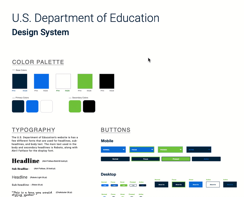
Navigation Components: The navigation components for the mobile and desktop redesigns of the U.S. Department of Education focus on ease of use, clarity, a bold look, and simple shapes.
New Wireframes Incorporated the following Key Updates:
-
Additional negative/white space
-
More images that better correspond to the content
-
Clear page sections, cards, and dividers to make information easier to view and find
-
More space dedicated to new menu items to make navigating the enormous amount of information on the site easier.
I used the wireframe mockups to create a clickable prototype that could be used to showcase and test the new navigation system and wireframe layouts.
UI Style Tile: The new Style Tile for the U.S. Department of Education aims to create a bold, helpful, authoritative, but also approachable brand feel for the website redesign. Friendly, colorful imagery of people and students, existing graphics from the department’s social media campaigns, and a more striking variation of the blue and green color palette were all incorporated.
UI Style Guide: The UI Style Guide expanded upon the Style Tile for the U.S. Department of Education. The guide added many new elements — lists, dropdowns, checkboxes — to contribute to the site’s bold look and organized, streamlined layout. I then applied the UI Style Guide to my low-fidelity desktop and mobile wireframes to create mid and then high-fidelity versions.
Mobile Wireframes: Along with the desktop wireframes, I also created a responsive web design grid system that would adapt to a mobile layout.
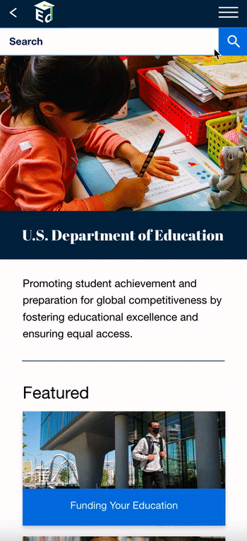
The final desktop and mobile prototype redesigns include iterations based on User Testing, incorporating menu and navigation changes, altered information architecture, and consistent, bold design to better convey the department’s mission and services.


Usability Testing


Resulting Iterations
User Testing + Outcomes
Rapid User Tests: In Rapid User Tests, I collected information on initial impressions:
-
Was the website’s purpose clear?
-
Was the initial impact appealing and trustworthy?
-
Were users inclined to remain on the website?
-
Did the menu navigation provide straightforward path for the users’ goals?
Users found the homepage to be bold and eye-catching, the site easy to understand and navigate, and the menu items straightforward and helpful — particularly For Parents, For Teachers, and For Administrators. They were also drawn to the Feature cards. One user pointed out confusion with the Login button’s purpose, leading to iterations on button name.
Second Round of User Testing: Overall, users found the mobile site easy to navigate and visually pleasing. There were a few notes and suggestions to consider for iterations:
-
Reordering select information sections, menu items, and buttons
-
Making Contact Us even more prominent and easy to find
-
Further utilizing the Helpful Links section
From User Testing insights, I applied changes to the prototype to address remaining pain points:
-
Contact Us added to menu items
-
Newsletter sign up added to mobile
-
Student Financial Aid menu reordered to start with Eligibility Requirements
-
Additional desktop menu iterations
-
Helpful Links tailored to match current page


Conclusion + Future Opportunities
The redesign of the U.S. Department of Education aimed to improve the navigation and visual elements of the desktop and mobile website so users could more easily find information and understand the department’s mission and services.
The final high fidelity prototype included new navigation layout, homepage, and iterated versions of both mobile and desktop primary pages, incorporating new UI assets to better organize the abundance of information offered by the department while presenting featured items, quick links, frequently asked questions, and blog highlights.
In the future, I would like to continue testing on navigation - focusing on A/B Testing in particular - add more tertiary pages, and incorporate additional components that could further streamline information within the page structures, such as additional drop-downs and bullet lists, which are currently used on only a few key pages but are helpful in reducing and organizing text.
Thanks for tuning in!