Rainbow Service Dogs Website Redesign
Designing and Coding a Responsive Platform

Executive Summary
For this website redesign and development process, our team’s goal was to update the website layout, navigation, and UI for Rainbow Service Dogs, an organization based in Tucson helping train service dogs for children, veterans, and low-income individuals. We also wanted to research and address any pain points with the donation process due to its importance to our stakeholder but lack of visibility on the site.
Designed to better convey the mission and services of the organization and establish a more enjoyable and streamlined experience for users, the resulting responsive redesign addresses the current UI pain points and implements desktop and mobile solutions via high-fidelity mockups and a live, coded prototype.

Before

After
Project Overview
Background: Rainbow Service Dogs is an organization geared towards helping individuals train their own service dogs with the support of peers and the community. They strive to keep fees affordable by offering group and private training based on a sliding scale and work with extremely low income individuals, children, and veterans. The organization has certifications from Animal Behavior College and trains all service dogs as per IAADP guidelines.
Problem: Despite a great deal of interest in supporting and donating to organization's helping train service dogs for people with mental or physical disabilities, the current Rainbow Service Dogs website is not attracting or retaining users sufficiently due to off-putting design, confusing navigation, and overwhelming information. Our user's interest in donating to or getting involved with Rainbow Service Dogs - an organization that helps owners train their own service dogs - is therefore jeopardized by her aversion to an unappealing website experience.
Solution: Our team used user-centric research and design to address existing problems and pain points relating to the current website navigation, information architecture, and UI and determine how the site could better tailor information to its key users, present extensive and important resources in a streamlined fashion, and embody an upbeat, hopeful tone for those seeking to get involved with or donate to the cause.

Project Team

Website Transformation
My Roles & Responsibilities
-
User Research Plan
-
Conducted User Interviews & Insight Analysis
-
Designed and iterated low-fi, mid-fi, and high-fi wireframes for the Meet Our Dogs section
-
User Testing and A/B Testing
-
Created the UI Style Guide Design
-
Designed the Meet Our Dogs section and desktop and mobile navigation
-
Coded the design system component library using HTML5/CSS (hosted on GitHub)
-
Coded various pages of the live prototype
Deliverables,
Tools Used,
Timeline & Scope
Deliverables: Responsive website for mobile and desktop, including homepage, navigation, and pages within our user flow (pages within the Homepage, About Us, Services, Meet Our Dogs, Donate sections). Coded pages included the Homepage, Services, Meet Our Dogs, and Donate.
Tools Used: Figma, InVision, Miro, Procreate, Zoom, Google Slides
Timeline and Scope: 3 Weeks — Design and Test Homepage, Services, About, Meet Our Dogs, Donate pages, and UI Style Guide. Code four pages for live prototype.
Team Members: Michelle Koglmier, Peggy Pease, Christina Gednalske, Kayla Martin


Usability Testing
Research & Findings
User Interviews & Survey: We began our research by gathering qualitative data from user interviews and website testing and quantitative data through a Google survey to understand users’ frustrations and goals when interacting with or donating to organizations online, specifically those training service dogs. Those who responded were overwhelmingly interested in the service dog cause and already inclined to donate to such an organization. However, we also found that they reported a strong dislike of confusing or overwhelming websites overall.
Usability Testing: We then had users test the navigation, layout, and UI on the current Rainbow Service Dogs website. They found that the website was unwelcoming, disorienting, and difficult to navigate -- with an overwhelming amount of information.
Affinity Diagram: From our research findings We used an affinity diagram to group our research findings and identify user insight that represented the majority of our users and could help us further understand our user's goals and frustrations.
Persona: We constructed our persona, Tammy, to identify insights showing challenges our users may be facing when visiting the Rainbow Service Dogs website, as well as users' overall pain points and goals when interacting with causes online.
Heuristic Evaluations: Our Heuristic Evaluations resulted in mid to poor marks in aesthetics, navigation, and content, implying a poor overall user experience. There were also areas for improvement in efficiency/functionality.
Accessibility Tests: When testing the color accessibility of the site, we uncovered issues with the current font colors — as well as the centered text alignment and many, clashing fonts and colors that created a disorienting feel for the viewer — which did not adhere to AA standards.


Feature Prioritization Matrix
User Journey Map
Definition & Synthesis
User Insight: Our user Tammy, a dog owner from North Scottsdale, AZ, is interested in contributing to organizations that train service dogs for people with disabilities. She believes it is important for people with disabilities to have access to this essential resource and would feel comfortable donating to such an organization. However, Tammy hates disorganized websites and would immediately feel disinclined to donate or get involved if a site proved to be frustrating, confusing, or untrustworthy, regardless of her belief in this important cause.
Problem Statement: Though our user is interested in helping organizations that train service dogs, she is equally if not more discouraged by websites that are off-putting, difficult to navigate, or disorienting. Her interest in donating to or getting involved with Rainbow Service Dogs - an organization that helps owners train their own service dogs - is therefore jeopardized by her aversion to an unappealing website experience.
Hypothesis Statement: How might we help users find the information they need through a more efficient and enjoyable browsing experience that better showcases the inspiring initiatives of Rainbow Service Dogs and motivates users to get involved or donate?
User Journey, Storyboard & User Scenario: We then created a User Journey Map, Storyboard, and User Scenario to envision how Tammy's step by step process would be when learning about the cause online and attempting to use the existing Rainbow Service Dogs website.
Brainstorming & Feature Prioritization: Using the I Like, I Wish, What If Method, we brainstormed ideas for features that could address our user's frustrations and goals. We then used the Feature Prioritization Matrix to determine which of these features were low complexity and high impact, making them feasible for a minimum viable product within our timeframe.


Card Sorting


User Flow
Sitemap
Ideation & Analysis
Moodboard Inspiration: We then used InVision to create a moodboard with inspiration from the organization's images, as well as other website UI, layouts, and patterns. Using this inspiration, we were able to start from the site's existing brand identity and bring together alternative colors, fonts, and layouts to help revamp the site’s look.
Card Sorting: The Rainbow Service Dogs website contains information spread out throughout the site without defined sections and with few navigation elements connecting them. Card sorting (define and group) helped established the needed sections, group information, find duplicates, and reorganize the connections to establish more fitting IA based on user feedback.
The structure step of card sorting allowed for a visualization of how the sitemap would eventually be organized, with the many pages coming together in an established hierarchy. At this point, it also became evident if there were additional repeated or unneeded pages that could be removed or combined to further streamline the navigation.
Sitemap Redesign: The card sorting process led to a new sitemap. The revised sitemap aimed to simplify and streamline the experience of navigating the site, paying particular attention to items mentioned in the usability testing.
.png)


Protoyping (low-hi)
Low-Fidelity Wireframes: Once we had established our user flow, we were able to start early feature sketches. After discussing and selecting specific sketches, our team worked together to develop low-fidelity wireframes and low-fi clickable prototype for our redesign. My area of focus included the menu navigation and Meet Our Dogs pages.
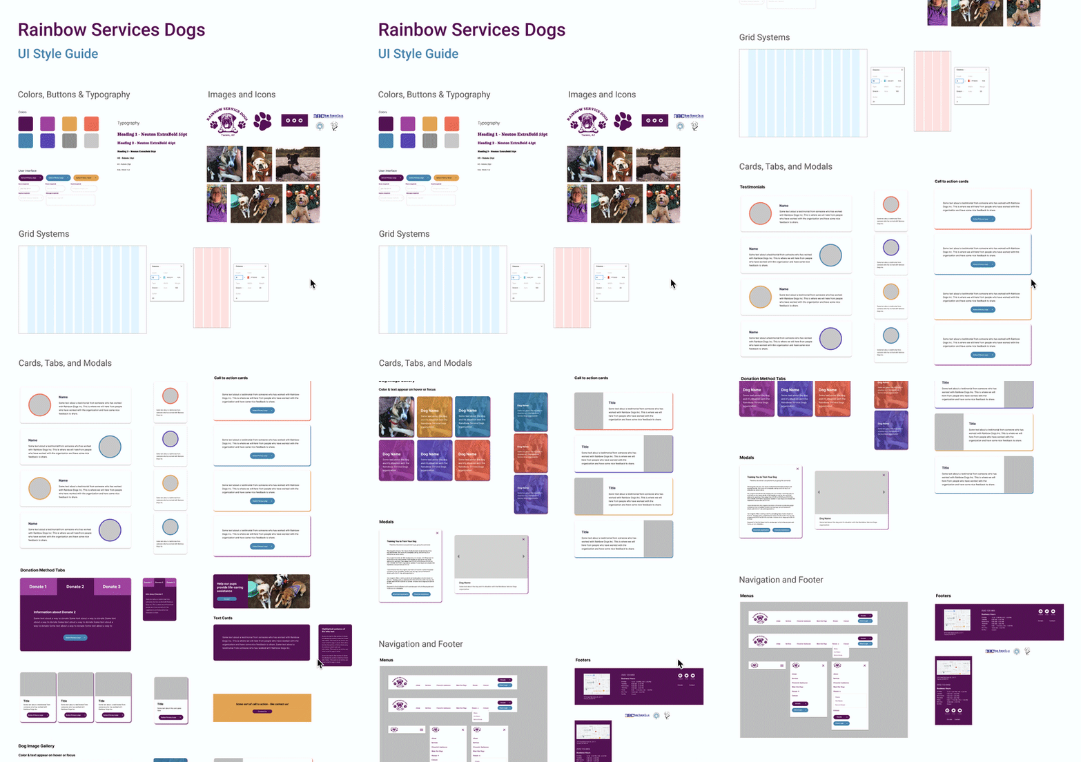
UI Style Guide: From our low-fi wireframes, we then developed the UI Style Guide by applying UI inspiration and ideas to our wireframe elements to create components with consistent formatting (color, font, spacing). We focused on creating adaptable card systems and other components that could work for all of our pages, and could later translate well into Bootstrap components in code. The guide expanded upon a UI Style Tile inspiration and moodboard in which we added inspiring images, colors, fonts, and layouts.
Mid-Fidelity Wireframes: UI style guide components were then applied to each team member’s low-fi wireframes to create our mid-fi wireframes and clickable prototype. We also incorporated a fixed grid system to assure that our layout would remain responsive.
High-Fidelity Wireframes: Incorporating findings from hero image A/B and preference testing showing a preference but similar performance for a second image, final desktop and mobile prototype iterations offer a high-fidelity experience of the website redesign.


User Testing


Resulting Iterations
User Testing + Outcomes
User Testing - Low-Fi: Once our low-fi wireframes were finished, we collected information on initial impressions for both the desktop and mobile versions:
-
Was the website’s purpose clear?
-
Was the menu navigation straightforward?
-
Did the user flow make sense?
-
Were all buttons and paths functional?
-
Could people envision what the overall interface was going to be?
We found that users found the overall interface to be straightforward and intuitive. Users were able to easily complete our usability tasks. There were a few areas of confusion due to wording, which was remedied once we moved into the mid-high fidelity mockups and began using accurate site content. We also had a few areas in which users located broken links in our prototype setup itself.
Additional User Testing - Mid and High-Fidelity: We then did multiple rounds of additional testing to determine further changes as we went from mid to high-fidelity and discovered a few remaining issues.
-
Minor navigation issues due to a lack of buttons on the homepage
-
Difficulty reading white text on specific images
-
Questions regarding our donation flow
-
Unclear wording for a few headlines
In turn, we added more buttons on the homepage to increase discoverability for the About page, added colored text overlays on some images, and simplified the donation process.
A/B Testing: We also did A/B testing for different versions of our page introductions. We found users spent more time reading white text on a purple card compared to black text on a white page, so we then included more purple text cards throughout the site introducing our pages.
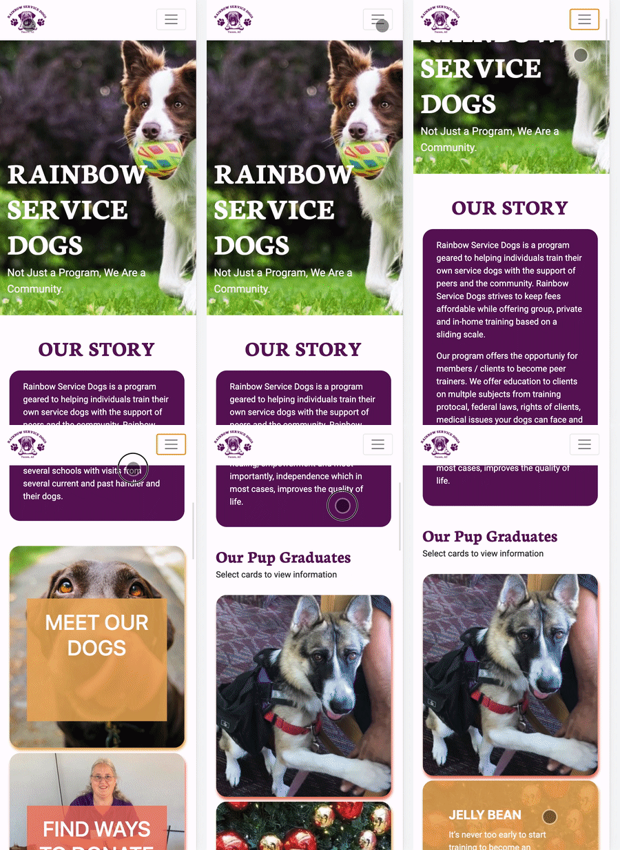
The final desktop and mobile prototype redesigns include iterations based on User Testing, incorporating menu and navigation changes, altered information architecture, and consistent, cheerful design to better convey the organization's mission and services.


Coded Component Library
Coded Component Library / Team
Design System
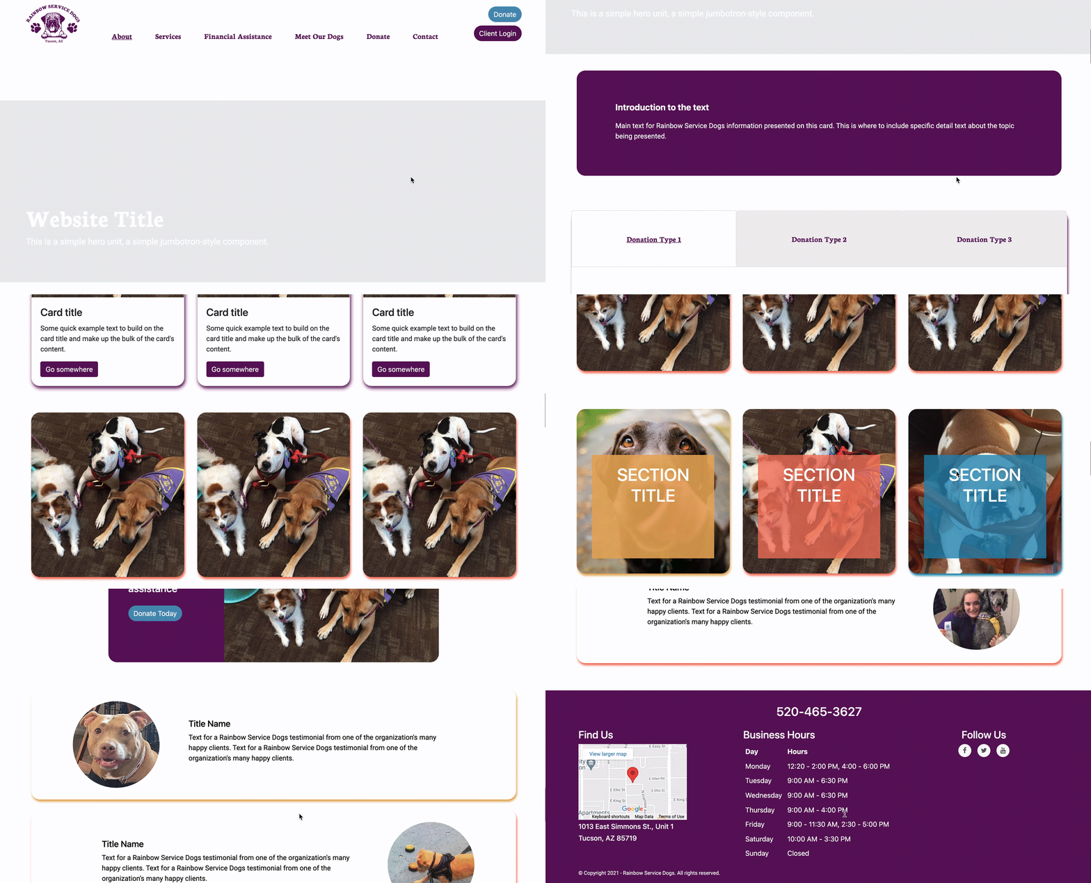
Throughout mid and high-fi prototyping, our team began coding the style guide elements and adding them to a shared component library in HTML and CSS, hosted in Github. We used the elements in this design system to build our four coded pages while sticking to our consistent design. This library included the navigation bar, footer, cards, modals, image containers, and tabs needed for us to fully develop four pages we selected from the site.
From this component library, we could all easily locate, place, and customize components on our pages while keeping to our cohesive design.
Live Coded Prototype
The resulting prototype included four pages: the Homepage, Meet Our Dogs, Services, and Donate. These pages incorporated the insights gleaned in user testing and came together to form a cohesive product showcases the strengths of the Rainbow Service Dogs organization while emphasizing and streamlining areas that encourage users to get involved or donate to this magnificent cause.
Conclusion + Future Opportunities
Our team went into this project hoping to create a redesign that would better present Rainbow Service Dogs and shed light on a truly inspiring cause. Relying on extensive user insight and testing, we succeeding in entirely updating the layout, navigation, and UI while still representing the organization’s identity. The result was a high-fi prototype, as well as a live prototype with four coded pages, with new look and feel that streamlined the overall user experience and donation process.
Moving forward we would like to code more of the pages in our high-fidelity prototype, use Google Analytics data to determine more areas for improvement on the existing pages, and continue to iterate animations and styling details.

