Redesigning the Hope For Children Website
A Responsive Mobile and Desktop Redesign Case Study

Executive Summary
Designed to better convey the services and mission of the foundation working to end child abuse, the Hope For Children responsive website redesign aims to bring increased awareness, credibility, and volunteering/donation motivation to the foundation by addressing existing pain points and implementing new mobile and desktop UI, navigation, layout, information architecture.


Project Overview
Background: Website Redesign of the Hope For Children Non-Profit Organization. Hope for Children is a certified charity mainly providing training and emergency services and contacts to help end child abuse and abuse to others.
Our team used user-centric research and design to address existing problems and pain points relating to the current website navigation, information architecture, and UI and determine how the site could better convey their purpose and raise awareness and money to protect children from domestic violence and sexual assault.
Problem: Our user is wary of unknown non-profit organizations. Though he sometimes donates to select causes, he is overall unlikely to volunteer his time. Currently, he doesn't feel he can trust organizations and their online platforms and is hesitant to dedicate more resources to causes.

My Roles & Responsibilities
-
Conducting User Interviews
-
Designing and iterating wireframes for the Homepage, Menu pages, and Donate Section
-
Developing the new Sitemap based on card sorting for enhanced information architecture
-
Creating the UI Style Guide Design


Deliverables, Tools Used, Timeline & Scope
Deliverables: Responsive website for mobile and desktop — Homepage, About Us pages, Volunteer Section, Donation Section, Success Stories sections
Tools Used: Figma, Miro, Otter, Zoom, Google Survey, Google Slides
Timeline and Scope: 3 Weeks — Design and Test Navigation, Homepage, Primary and Secondary pages, and UI Style Guide


Research & Findings
Our team gathered qualitative data from five user interviews and website usability tests. Quantitative data was also gathered through a survey sent out via email and social media over a period of two days. We grouped findings in an Affinity Diagram to understand collective pain points and goals related to non-profit efforts and determine would motivate them to volunteer, donate, or otherwise become informed or involved in different organizations. We also had interviewees test out the current Hope for Children website to identify key frustrations with navigation, UI, and information architecture.
User Persona: We used the insights from our interview affinity diagram, survey results, and testing feedback to create a user persona, Patrick Poe, embodies the goals and pain points our users face when researching and getting involved in non-profit organizations. We referred back to Patrick for the entirety of our project to inform decisions and ensure user-centric solutions.
“I’m concerned the money won’t go directly to the people’s needs.”
“I would rather donate my time or actual items rather than money.”
“I am motivated by good causes and missions that have clear value.”


Definition & Synthesis
User Insight: Our user, Patrick Poe, is not very inclined to actively contribute to causes and prefers to donate money. However, he is also wary of donating online unless he has firsthand knowledge of the organization’s work and is certain its mission and causes are legitimate — preferably he would like to see this with his own eyes. He mostly finds out about causes by word of mouth and needs to know he can trust an organization and platform in order to dedicate more resources to a cause. Overall, he lacks incentives to become more actively involved in NPOs.
Problem Statement: Our user is wary of unknown non-profit organizations and, though he sometimes donates to select causes, is overall unlikely to volunteer his time. Currently, he does not feel he can trust organizations and their online platforms and is hesitant to dedicate more resources to causes.
User Journey: We used our user insight to create a storyboard and User Journey Map depicting a difficulty scenario may have had that would account for his current pain points regarding NPOs and donating online.


Ideation & Analysis
Ideation: Using the I Like, I Wish, What If method and the Prioritization Matrix, we took our user interview and survey data and expanded on our findings to come up with three unique features that could be used to address our user’s pain points. Our features included Volunteer Profiles, Donate by Category, and Individual Success Stories.
Card Sorting: During our card sorting stage, we defined and grouped the existing website categories to analyze the information architecture and develop a more effective system for our users.
Sitemap: The current Hope for Children website sitemap does not present clear, intuitive categories for users. Our updated sitemap regroups elements to offer clarity to users, particularly in regard to what the organization does and what individuals can do to get involved and help the organization’s mission.
User Flow: Our team established an ideal user flow from our user’s goals, focusing on how one would confirm the organization’s credibility and past performance, learn how to get involved, and donate.


Protoyping (low-hi)
Low-Fidelity Wireframes: Our team worked together to develop a wide range of low-fidelity wireframes and low-fi clickable prototype for our redesign. My area of focus included the Homepage, the Menu pages, and the Donate section pages.
UI Style Guide: Our UI Style Guide combined low-fi wireframe elements to form consistent cards, buttons, menus, footers, and more. We developed the UI Style Guide by taking our diverse wireframe elements and putting them into formats that were consistent with spacing, color, font, and overall style. The guide expanded upon a UI Style Tile inspiration and moodboard in which we added inspiring images, colors, fonts, and layouts.
It was important to us to convey a cheerful, uplifting message — particularly while addressing these serious topics — in order to offer hope to those looking for help and motivation to users deciding whether or not to get involved in Hope For Children’s mission.
Mid-Fidelity Wireframes: UI style guide components were then applied to each team member’s low-fi wireframes to create our mid-fi wireframes and clickable prototype. We also incorporated a fixed grid system to assure that our layout would remain responsive.
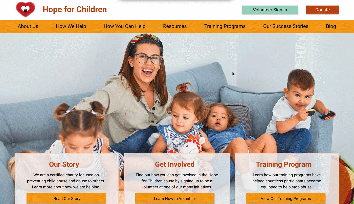
High-Fidelity Wireframes: Incorporating findings from hero image A/B and preference testing showing a preference but similar performance for a second image, final desktop and mobile prototype iterations offer a high-fidelity experience of the website redesign.


User Testing + Outcomes
We tested our prototype at each stage of the process — low-fidelity, mid-fidelity, and high-fidelity — to locate any usability or accessibility issues. Iterations were made after the mid-fidelity tests that included changing button text to black improve color accessibility and adding buttons to cards to improve discoverability. We also iterated on our menu header.
Our high-fidelity A/B and Preferences tests allowed us to try out two images to determine if our users’ behavior changed, as well as establish the preferred image. There was no notable behavior difference between the two, but our users overwhelmingly preferred an image of a family to an image of two children having a pillow fight. This discovery helped us with our final iterations and noticeably improved the look of the final prototype.
Wireframe Iterations:
Hero Card Buttons
Button Text Color
Menu Header Iterations
Hero Image Change

Conclusion + Future Opportunities
Takeaways: We discovered that it is important to remember that our preferences may not always be the best solution for our user — as was the case in the A/B and Preference Testing for our hero image. This discovery reaffirmed how important it is to test often and consider user feedback whenever possible.
Overall, we aimed to stay true to our user and develop a final prototype that directly addressed his concerns and journey related to researching and getting involved in non-profit organizations.
In the future, we’d love to revisit some of our images and continue testing and iterations on their effectiveness. We also would like to add interactive elements and animations throughout the site to further enhance the delight users experience while using the platform.
Conclusion: Throughout the research, analysis, ideation, wireframing, prototyping, and testing of the Hope For Children website redesign, our team focused on key features that would increase reliability, trust, transparency, and trust. With the new menu system, UI, and focus on user involvement, the new Hope For Children website keeps the user in mind each step of the way, aiming to offer a straightforward, reliable experience.
By using these solutions to put donors and volunteers’ minds at ease, we hope to motivate them to become more involved in the organization’s mission.