Eco Friendly
Mobile App Design - Local events, challenges, friends, and resources to help you help your environment

Executive Summary
Eco Friendly was designed to motivate individuals to get involved in sustainable living and environmentally friendly initiatives in their area while encouraging family and friends to do the same. The app is a location-based platform that includes information on local events and initiatives, a recycling center locator, and personalized eco challenges


Project Overview
Background: A location-based platform that encourages people to get involved in helping the environment and challenge themselves and others to take action.
Problem: Users are worried about the environment but are frustrated and want to become more motivated and informed. Current resources do not make it easy enough to find comprehensive information and get motivated to contribute to environmental efforts. This is causing people to feel discouraged about their impact and prevents more action from being taken.
Solution: Eco Friendly was designed to motivate individuals to get involved in sustainable living and environmentally friendly initiatives in their area while encouraging family and friends to do the same.

My Roles & Responsibilities
-
User Interviews, User Journey Map
-
Research Findings Analysis and Synthesis
-
User Persona
-
Competitor Analysis
-
Ideation
-
User Flow Development
-
Paper Prototype Mockups
-
Low, Mid and High Fidelity Wireframes
-
User Testing
-
Design Iterations and Final Clickable
-
User Flow Development
Deliverables, Tools
Used, Timeline & Scope
Deliverables: Mobile App High Fidelity Prototype - Carbon Footprint Survey/Onboarding, Home/Dashboard, Recycling Center Locator Feature, Local Initiatives Feature, Challenges/Invite Friends Feature
Tools Used: Figma, Miro, Otter, Zoom, Google Survey, Google Slides
Timeline and Scope: 3 Weeks - Design and Test Navigation, Home/Dashboard, and App Features
Team Members: Michelle Koglmeier


Research & Findings
Our team wanted to understand how people currently approach sustainable living. Are they involved in helping the environment and, if not, what’s stopping them and what would motivate them to do more?
We completed 5 user interviews and sent out an online survey via social media and email.
Survey Insights:
-
65.5% of people wished that their friends and family were more motivated to help the environment.
-
The overwhelming majority at 76.8% of people surveyed spend no time outside of their homes on environmental efforts.
-
83.3% of people we surveyed stated they find that there is a lot of misinformation about recycling and sustainability on social media resources to causes.
In interviewing target app users, we found several key pain points and goals that were common throughout the interviews.
Interview Insights:
-
Worried about the environment, but not very involved
-
Desire to feel connected and encouraged
-
Desire to help, but felt overwhelmed or unable to make an impact
-
Wished they could more see their actions benefiting the whole and themselves
Persona: Using the data from our we created our Persona, Julie. Julie is a wife and mother of 3. She cares about her family so much and is concerned about the earth for their future. She feels discouraged and overwhelmed while researching environmental topics. How can she, one person, make any kind of real impact? She wants to become more informed and be able to do small sustainable acts that she can see those results and positive impact first hand.


Definition & Synthesis
How might we improve how individuals learn about and get involved in environmentally friendly initiatives to make contributing to these efforts easier, more fun, and more rewarding, so that they can spend less time searching for information and initiatives and more time actively helping the environment while encouraging others to do the same?
Through a competitor analysis of three direct competitors and two indirect competitors, we were able to determine some must-haves for Eco Friendly, as well as some areas where improvements could be made:
-
Best Practices
-
Survey
-
No sign up/optional profile
-
Tailored information
-
Cheerful, clean UI
Areas for Improvement:
-
Avoid information overload
-
Improve upon social elements
-
Stay specialized
We then created a storyboard to show a visual representation of our users journey discovering and using Eco Friendly. Our storyboard and user journey map helped us create a user flow with the features ideated in our prioritization matrix.
.jpg)

Ideation & Analysis
Ideation: Using the I Like, I Wish, What If method and the Prioritization Matrix, we took our user interview and survey data and expanded on our findings to come up with three unique features that could be used to address our user’s pain points. Our features included Volunteer Profiles, Donate by Category, and Individual Success Stories.
Eco Friendly’s Approach:
-
A focus on local events
-
Make it simple and fun to take action
-
Connection and motivation
-
Area specific tips and resources
Resulting Features:
-
Survey/self-assessment
-
Goals and challenges
-
Find recycling facilities
-
Suggestions for how to help
-
Local events & activities


Protoyping (low-hi)
Paper Prototype: We first created a paper prototype of our features and homepage/dashboard, with an emphasis on the individual and local area to decrease the overwhelming feeling our users often face when addressing environmental issues and make their impact visible. We also wanted to bring issues “close to home” and add a social aspect to create a positive feedback loop and reward.
Mid-Fidelity Wireframes: Our mid-fidelity wireframes iterated on our paper prototype to update the user flow and digital wireframes, address problems uncovered in the testing and start to hone to interface look. At this point, our wireframe design goals were to keep the app simple and straightforward to prevent app users from becoming overwhelmed. We aimed to stick with a well-organized to deliver a substantial amount of information clearly.
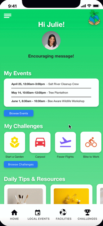
Hi-Fidelity Wireframes: After our wireframe testing, we ended up with this final prototype. We wanted our logo to represent people coming together to help the environment and included a welcoming information page and survey, which provides an idea of the user’s current impact on the environment, as well as tips and information in areas they can improve.
Logo: Earth-friendly and simple
Survey/Onboarding: Convenient too to assess environmental impact and find areas to improve
Design Aesthetic: Simple and clean, with a positive tone and cheerful colors
Features/Navigation: Thorough and easy to use with intuitive pathways
Overall, we wanted our design aesthetic to be simple and clean, with a positive tone and cheerful colors. And for the features to be thorough and easy to use, with intuitive navigation and pathways. Our Home Dashboard includes tips and a weekly spotlight, as well as information from each of the three features that can be reached directly from their sections on the homepage or through the recognizable toolbar and icons at the bottom. These two pathway options facilitate easy navigation - and aim to simplify the content while keeping relevant information front and center for the user.


User Testing + Outcomes
During our user testing phase, we wanted to see how easily users could navigate our app and if it addressed their needs without become too confusing or overwhelming. We each conducted tests and found that there was confusion surrounding our icons. They were not clear enough to the users. There was some wording issues that seemed to confuse some people as well as some navigation problems, mainly in our challenges section. We were able to take this feedback and change some icons and add labels to them. We removed some items that felt unnecessary and we updated some of the navigation.
Objective: Is Eco Friendly easy to navigate? Do the features address the users’ needs without overwhelming them?
Results/Insights: Our testers pointed out some confusion with icons, wording, and navigation, particularly regarding the Local Events and Challenges/Friends features
Solutions to Concerns/Feedback:
-
Changing icons and wording, adding labels
-
Clarifying navigation paths and elements
-
Removing unhelpful or unneeded items

Conclusion + Future Opportunities
Together we were able to identify a problem faced by our users - determining some of the reasons keeping them from getting more involved in helping the environment - and work together to design a solution that could address it in the form of Eco Friendly - just in time for Earth Day!
Eco Friendly in the Future:
-
Additional elements and features: reminders or prompts, calendar of events, and chat
-
Continue to refine our design, iterate, and test to further streamline the experience