Aksharam Mission UX Consulting
UX Research and Design Consulting for Nonprofit Organization Website Design

Executive Summary
Consulting work for on a website design for the Aksharam Mission, a nonprofit organization helpful American-Indians remain connected to Indian culture and preserve the Malayalam language. The organization created this website to better convey the inspiring purpose and initiative of the organization to a bilingual audience.
Research and analysis of the existing website aimed to identify existing pain points for users and determine ways to further enhance the presentation of the organization's mission and initiatives, clarify user flow, and iterate on content and design elements to create a more trustworthy, enticing platform through which users can get involved with or donate to the organization.
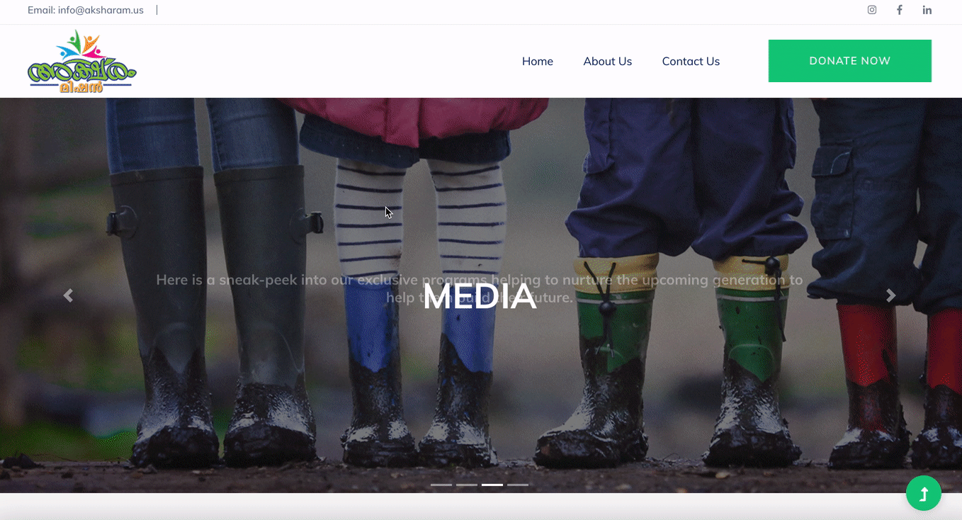
Aksharam Mission Website - In Progress
Project Overview
Background: The Aksharam Mission is a non profit organization based in Arizona that provides and supports educational opportunities for children living in India while continuously working to preserve the culture and language of Malayalam across the globe through various workshops, classes, and a dedicated Malayalam library located in Scottsdale, AZ.
Problem: The current website prototype is simple and fairly effective but requires further research and evaluation to determine opportunities to optimize navigation, information architecture, and UI. Our team will research, analyze, and suggest elements or areas that could benefit from changes or redesigned elements to further improve clarity and credibility.
Solution: Using user testing and insights, our team identified ways to clarify the user flow, improve credibility through new content and media, and iterate on specific design choices that create confusion for the user or presented usability challenges.
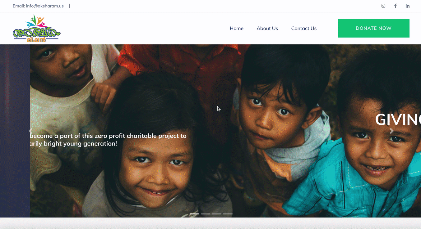
Homepage - In Progress
My Roles & Responsibilities
-
Developing the User Research Plan
-
Conducting User Interviews and Usability Testing
-
Conducting a Large-scale User Survey
-
Analyzing and synthesizing findings to create a User Persona
-
Iterating on the Sitemap and Navigation for enhanced Information Architecture
-
Tested Site Colors, Fonts, and other Items for Accessibility Standards
-
Identifying and suggesting Design Iterations
-
Identifying and suggestions changes to Content and UX Writing for enhanced credibility
Deliverables,
Tools Used &
Timeline / Scope
Deliverables: User Research Findings, Suggestions for Design Iterations, Navigation and Information Architecture changes, Content (copy, images, and videos) improvements and considerations
Tools Used: Google Survey, Figma, Miro, InVision, User Research & Testing, Heuristic Analysis
Timeline and Scope: Two Weeks - Analyze User Experience and Flow via Findings through User Interviews and Survey, Ideate and Define changes, Develop Considerations and Suggestions to improve UI, navigation, layout, UX writing, and content for the Aksharam Mission responsive website to enhance credibility and improve performance (donate and volunteer), keeping in mind stakeholder feedback and needs.


Research & Findings
User Interviews & Survey: We began our research process by gathering qualitative data through user interviews, as well as quantitative data via a Google Survey. Our goal was to determine what users look for when determining the credibility of a non-profit organization when viewing a website, as well as their goals and pain points pertaining to getting involved in a cause or donating to an organization online.
Heuristic Evaluations: Our Heuristic Evaluations resulted in solid marks in appearance/aesthetics but lower marks in navigation, content, and efficiency/functionality.
Accessibility Tests: When testing the color accessibility of the site, we uncovered issues with the current text and background colors for certain cards, some of which do not pass the AA standards when in hover mode.
Usability Testings: We conducted usability tests to determine how easy the website was for users to navigate and observe if they found the site credible. We discovered users did not trust the website due first and foremost to lack of reputable, original content or spelling and grammar errors. Users were hoping to see credible proof of the organization's status, which they could not locate. Users also felt that the menu items were sparse and did not do much to help them locate information on the site, and instead resorted to links and cards on the homepage.

Research Findings and Affinity Diagram Groups


Grouping and Prioritization of Usability Test Results

Analysis & Definition
Affinity Diagram: We then took our findings and grouped them into categories in an Affinity Diagram to further understand our user's pain points, goals, and approach to interacting with NPOs online.
Testing Result Matrix: We also organized our usability testing results by category and frequency of response, then moved the them into a prioritization matrix to determine which items were high priority for both users and the organization to determine which matters needed to be addressed first.
Site Priorities: We identified that key areas to address first were navigation, content, and accessibility, with the goal of enhancing the site's credibility, clarity, and usability - all three of which users has called into question.
Credibility proved extremely important for users, yet they reported a lack of credibility on the site due to stock content, spelling and grammar errors, and missing NPO status information. They also expressed a lack of clarity regarding the mission and initiatives, with copy failing to clearly state both. In addition, users reported difficulty navigation to some of the main pages, and expressed the need for more menu items to aid in discoverability.

Users reported that the minimal menu did not present enough assistance when navigation the site's contents


Dark blue hover phase presents accessibility issues as text becomes illegible
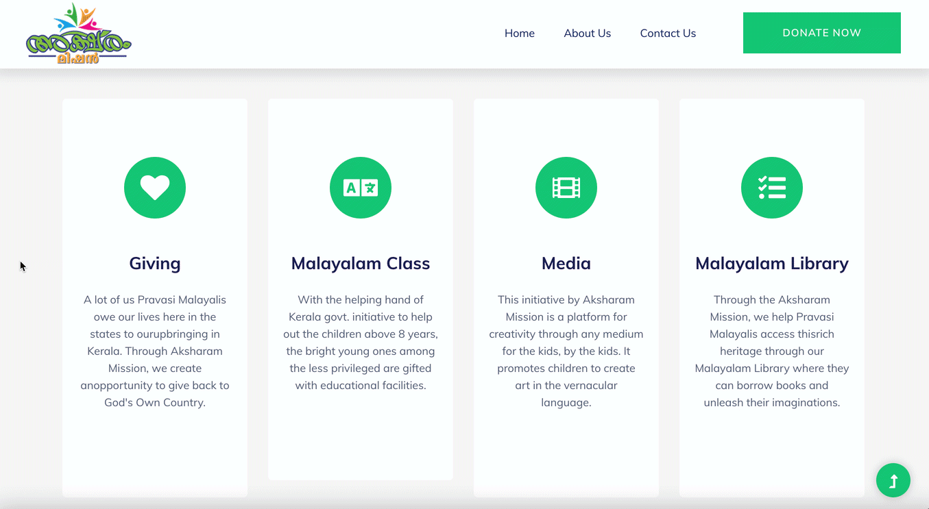
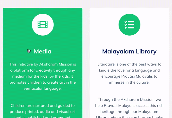
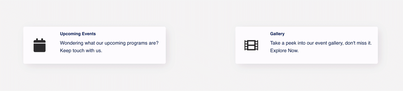
Only the feature card titles, rather than the entire cards, are clickable, leading to low discoverability
Design Recommendations
We then took our findings from our usability tests, accessibility tests, and heuristic analysis and condensed them into actionable design recommendations to help enhance the site's navigation, accessibility, and content.
Recommendations:
-
Clarify homepage carousel content to better inform users about the organization
-
Add Credible NPO Status Information
-
Expand menu to include initiatives and get involved so users can more easily locate these main sections and navigate via menu rather than relying on page cards and links only
-
Update and polishing copy / removing any grammar or spelling errors
-
Change dark blue hover phase color on cards to meet accessibility standards
-
Use original images rather than stock images
-
Include promotional videos throughout the site
Suggestion Examples:
Addition of NPO Status Information
User Feedback:
-
User Wants to see the status of the organization (501-C3) etc.
Suggestion:
-
Add this information and make as prominent as possible - Consider adding within hero moving image
Change in Information Architecture / Navigation
User Feedback:
-
"Get Involved is not easy to find, but it's there"
-
"Trouble finding services/initiatives - identified them because seemed like only possibility, but did not feel like that was correct. (there is no identifier)"
Suggestion:
-
Consider adding "Get Involved" and "Initiatives" items/pages to the menu so this information is clearly visible above the fold.
-
Consider changing the layout of the secondary page from horizontal card to vertical format with an image
Addition of Original Content
User Feedback:
-
"I was hoping to see testimonials and few real images"
Suggested:
-
As discussed in the meeting, try to use real content like images, feedback or paper clippings from the past services as testimonials. Even if low quality, including a gallery of real images from the initiatives is inspiring


Menu items were added to make it easier to find the site's main sections


Hover phase colors were updated to better meet accessibility standards
Entire cards were made clickable to increase discoverability
Homepage content was updated to better inform users of the organization's mission and services.
Resulting Iterations
Leading up to their launch, our stakeholders decided to incorporate many of the design recommendations.
-
Content - Copy and images that could better cater to an English audience and focus on the answering the questions "Who are we?" "What do we do?" Content updates also highlighted the nonprofit's U.S. charity status and corrected any spelling or grammar errors.
-
Information Architecture - Changes in the sitemap and the addition of menu items to represent the site's main sections and make it easier to find services.
-
Accessibility - Updated hover colors to better pass accessibility standards.
-
Functionality - Made entire feature cards clickable for easier access to sub-pages.
The organization held off on certain suggestions that could not be completed until appropriate materials could be acquired at a later date - such as replacing stock images with professional-looking photos from inside the organization.
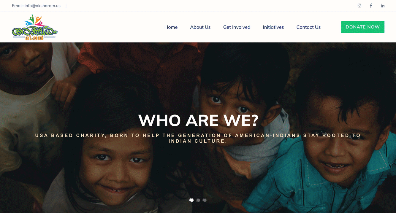
Desktop Prototype with Iterations
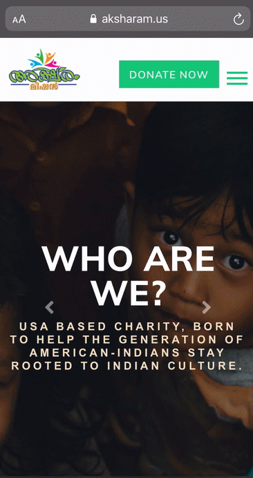
Mobile Prototype with Iterations
Conclusions & Future Opportunities
While there are still additional opportunities to further improve the accessibility, content, and navigation of the site, the changes made from our team's recommendations - informed by user research and testing - enhance the site's usability by allowing users to more easily find information regarding the services and mission of this inspiring organization. We hope our findings and suggestions have helped give the platform a more credible and trustworthy feel.